Bloobey Font: Adding Whimsy to Digital Layouts
I was staring at a hero section for a new children’s educational platform, and something felt off. The layout was clean, the colors were vibrant, and the imagery was high-quality, but the typography felt sterile. It lacked the tactile joy that defines early childhood learning. This is often the challenge when designing for younger audiences or playful brands; standard geometric sans serifs can feel too corporate, while traditional handwritten scripts often fail readability tests on mobile screens. That was the moment I decided to test Bloobey, a display font that promised to bridge the gap between professional structure and childlike wonder.
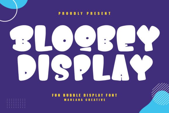
Testing a new typeface in a live project environment is always different than viewing it in a specimen sheet. When I dropped Bloobey into the main headline, the difference was immediate. The bold strokes and rounded terminals didn't just sit on the screen; they seemed to bounce. As a web designer, my first concern with any decorative font is usually rendering performance and legibility at various sizes. Bloobey surprised me by maintaining its integrity even when scaled down for tablet views. It manages to be whimsical without sacrificing the structural clarity needed for digital interfaces.
Evaluating Readability in Hero Sections
The primary use case for Bloobey in this project was the above-the-fold content. In UI design, the hero section has seconds to communicate value and tone. Because Bloobey is a display font, it carries significant visual weight. I found that it works best when given ample breathing room. Crowding this typeface against other elements diminishes its impact. When testing the headline "Learn Through Play," I increased the line height slightly more than I would for a standard sans serif. This adjustment prevented the bubbly characters from feeling cramped and improved scanning behavior for parents quickly assessing the site's relevance.
One practical observation during the design phase involved contrast ratios. Bloobey’s thick strokes make it excellent for accessibility compliance when paired correctly. On a light cream background, using a deep navy version of the font passed WCAG AA standards effortlessly. However, I did have to be cautious when placing text over photography. Unlike thinner fonts where you might rely on a subtle drop shadow, Bloobey requires either a solid color block behind the text or a very dark overlay on the image to ensure the rounded edges remain distinct. The font’s personality shines brightest when it isn't fighting for attention against complex visual noise.
Strategic Font Pairing for Web Interfaces
A common mistake I see in playful web design is using a novelty font for everything. This creates cognitive load and exhausts the user. Bloobey is a specialist, not a generalist. For the body copy of the educational platform, I paired it with a neutral, humanist sans serif. The contrast between the exuberant headers and the calm, readable body text created a balanced visual hierarchy. This pairing signals to the user that while the brand is fun, the content is trustworthy and organized.
- Headlines: Use Bloobey for H1 and H2 tags to establish mood and capture attention immediately.
- Navigation: Avoid using this font for primary navigation menus; stick to simpler typefaces for utility links to prevent confusion.
- Body Copy: Reserve Bloobey for pull quotes, testimonials, or short feature highlights rather than long-form reading.
- Buttons: Test carefully; while great for large CTAs, it may lose definition on small secondary buttons.
This strategic restraint actually amplifies the effectiveness of the font. By limiting Bloobey to specific touchpoints, each appearance feels intentional and special rather than chaotic. It guides the user’s eye through the page, creating a rhythm that supports both engagement and conversion goals.
Mobile Responsiveness and Touch Targets
Designing for mobile requires a rigorous stress test of any display font. What looks charming on a 27-inch monitor can become illegible blob on a smartphone. During responsive testing, I discovered that Bloobey holds up remarkably well due to its open counters and consistent stroke width. However, scale matters immensely. On mobile breakpoints, I had to adjust the font size scaling ratio to ensure the letters didn't become too massive relative to the viewport width. There is a sweet spot where the font remains expressive without dominating the entire screen real estate.
I also tested Bloobey in interactive elements, specifically call-to-action buttons. For a "Start Free Trial" button, the font added a layer of approachability that standard system fonts couldn't match. It made the action feel less like a commitment and more like an invitation. However, for smaller utility links like "Log In" or "Terms of Service," I reverted to the supporting sans serif. The goal in UX is clarity first, decoration second. Bloobey enhances the experience when used for primary actions but could hinder usability if applied to dense interactive clusters.
Brand Identity Beyond the Website
While my primary focus was web implementation, choosing a typeface like Bloobey has implications for the broader brand identity. Consistency across digital assets builds trust. I utilized the same font family for social media graphics, email newsletter headers, and digital ad banners. This created a cohesive ecosystem where the user feels they are interacting with the same entity regardless of the platform. The alternate characters included in the font file were particularly useful here, allowing for variation in marketing materials without breaking the visual language.
For designers considering this typeface for client work, it is essential to verify licensing for these extended uses. Commercial font licensing varies, and ensuring you have the right coverage for web embedding, app usage, and social media promotion protects both you and your client. Additionally, checking the available file formats ensures smooth integration across different design tools and CMS platforms. Having access to multiple weights or stylistic alternates can save hours of custom lettering work later in the project lifecycle.
When to Choose Whimsy Over Convention
Not every project needs a font like Bloobey, and recognizing when to use it is part of mature design judgment. It is ideal for boutique toy stores, creative portfolios for illustrators, coaching websites focused on inner child work, or landing pages for family-oriented apps. It communicates safety, creativity, and optimism. Conversely, it would likely be inappropriate for financial services, legal firms, or luxury fashion brands where precision and exclusivity are the primary signals.
In the case of the educational platform, the switch to Bloobey transformed the digital presence from generic to memorable. It wasn't just about aesthetics; it was about aligning the visual interface with the emotional core of the product. Parents visiting the site weren't just reading text; they were feeling the brand's promise before they even engaged with the content. That is the power of thoughtful typography in web design. It turns layout decisions into emotional connections.
Ultimately, integrating a distinctive display font requires balancing artistic expression with technical pragmatism. You must consider load times, fallback stacks, and cross-browser rendering alongside kerning and color theory. But when executed correctly, as with Bloobey, the result is a digital experience that feels human, crafted, and genuinely delightful. It reminds us that even in the structured world of grids and code, there is always room for a little bit of magic.